Visuelle Kommunikation
Master
Onur Akkurt
The Turkish Newspaper Design
A newspaper is a serial publication, which contains news on current events of special or general interest. Its individual parts are listed chronologically or numerically and appear frequently, usually at least once a week but sometimes fortnightly or monthly. Traditionally, newspapers are printed on newsprint and usually are appear without a cover, folded rather than bound, with a masthead. They may include supplements such as colour magazines, or other inserts for special features or events.
In the present day, compared to the past, newspaper publishers are attaching more importance to aesthetics alongside contents. Especially since onset of industrialization, it has become easier to apply visual elements to design; and by now it has become quite normal that, as a result, visuals have assumed more importance and that, consequently, the discipline of newspaper design is continuing to develop day by day.
For printing and also to report occurrences, journalism has a structure which heavily relies on the time factor and recurs every day. This structure based on speed solely relies on readers taking the newspaper due to the way the front page is structured. However, today the sources of these news are all the same and it is important how the news are presented. This situation determines the shape of the design according to readers’ expectations.
In Turkey and in most other countries, the visual design of newspapers is, along with the content, an effective concept, which ultimately determines their quality. When we talked about journalism before, it was ‘five Ws and one H’ referring to ‘When, What, Where, Which, Who’ and ‘How’, while at the present it is called ‘five Ws, one H, and one D’ with D referring to ‘Design’. But in countries such as Turkey, which have prominent gap between different cultures in itself, have clearly different disciplines in design.
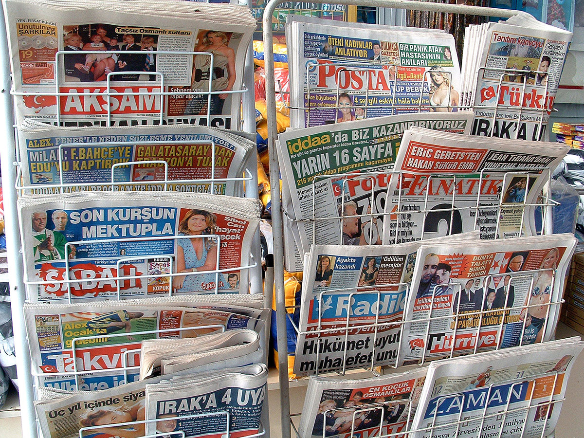
In a cultural context, given that there are a lot of differences between Turkey and other countries with a high literacy rating, the understanding and application of design and its elements are highly specific. In fact, newspaper designs use the same data even though their graphical design work differs. In general, typography, colour, paper, photography, caricatures, and graphical drawings are as important to newspaper design as they are to graphical design. In fact, these differences are quite visible when you compare Turkish newspapers to newspaper designs from other countries.
Since the beginning of journalism, the purpose of newspapers is to transfer the news to the reader with the help of texts and visual elements. The same as designers in other countries, Turkish designers have their own, distinctive characteristics. The purpose of this research is to understand the characteristic distinctions of Turkish newspapers and list examples of more recent Turkish newspaper designs, which are designed to reach the targeted reader profile.
Onur Akkurt
onurakkurt@hotmail.com.tr
Institut Visuelle Kommunikation, FHNW HGK, Freilager-Platz 1, CH-4023 Basel
+41 61 228 41 11, info.vis_com.hgk@fhnw.ch, www.fhnw.ch/hgk/ivk


