Visuelle Kommunikation / INTERNATIONAL MASTER OF DESIGN UIC / HGK FHNW
Nakwon Seo
Alternative data visualisations of the world map
![]()
![]()
![]()
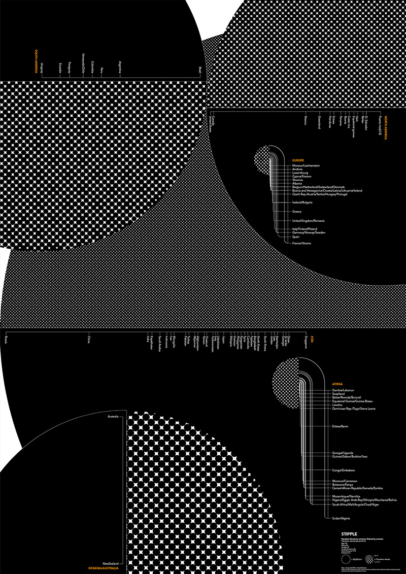
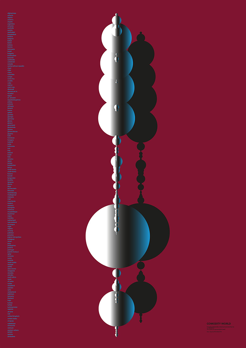
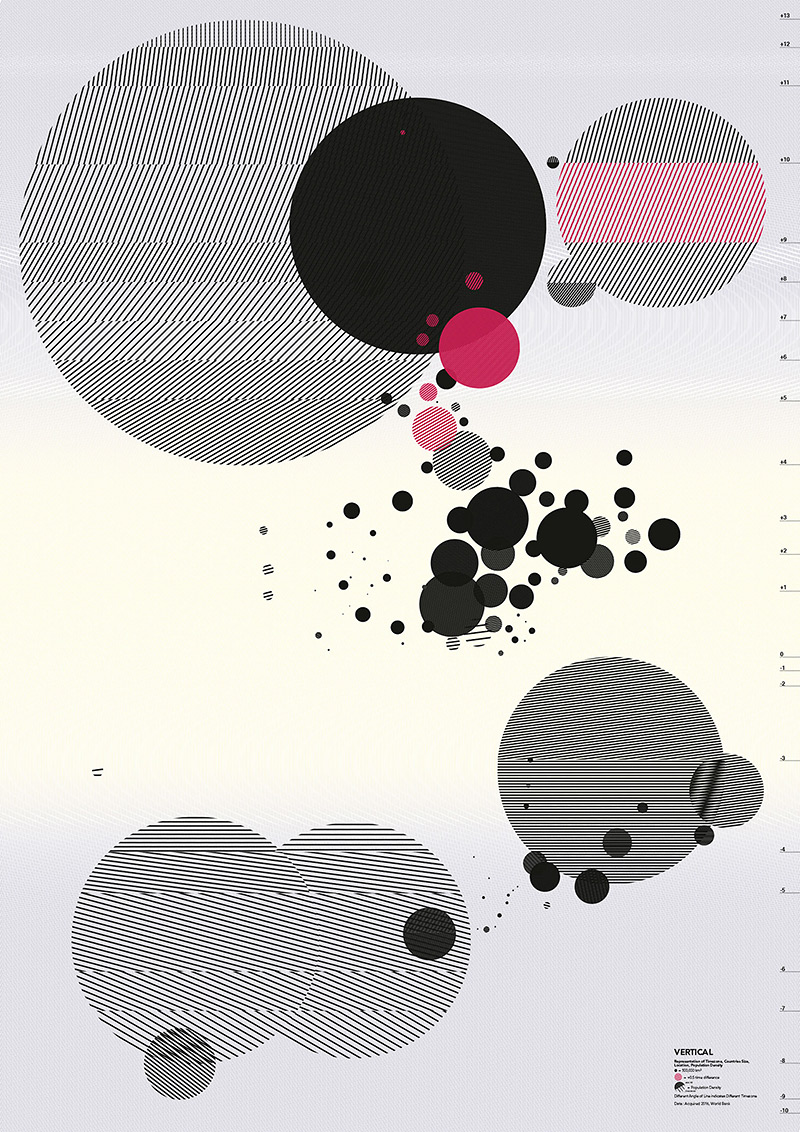
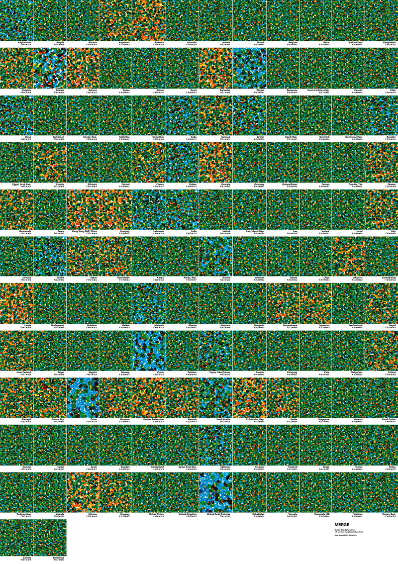
90% of the world’s data has been created in the last two years. Our world map representation has not been changed for centuries.
We misunderstand Earth because we do not show it based on data. Country shapes are not shown correctly, yet we believe in them. Africa looks as big as Greenland, yet it is 14 times bigger. Country borders are decided while looking at a misrepresentation of the countries. The conventional world map is indoctrinated historically and in desperate need of innovative ways of visualisation. How can visualisations benefit data understanding How can we feel the world’s data? How can we disconnect from and deconstruct stereotypes? Where does data representation need to go for understandable big data visualisations?
Mrs. Seo’s work examines the traditional, contemporary, and futuristic side of data representation through use of the world map’s data.